It can be intimidating to create your own infographic when you don’t have a design background. You could always commission an agency or hire a designer — but that can get pricey fast. To create professional-looking infographics and captivate your audience, you can benefit from learning how to create your own infographics in PowerPoint.
PowerPoint can be a marketer’s best friend when it comes to visual content creation. In fact, Infographics are the fourth most used type of content marketing. And it’s plain to see why, marketers who align the topic, content, and style of their infographics with the needs and preferences of their target audiences are still finding success among their audience.
So you may be thinking, where do I start? We’ll guide you through how to create your own infographics and even give you examples of different types you can work with using our 15 fabulous infographic templates for free within PowerPoint.
For better comprehension, we’ll walk through how to make a simple timeline infographic in PowerPoint.
1. In the Design Tab, adjust the Slide Size to best fit your infographic.
To begin making an infographic from scratch, you have to readjust the size of the PowerPoint Slide to give you more space to work with.
Begin by opening a new PowerPoint, in the top navigation bar, click on Design and select Slide Size.
Then in the drop-down menu, select either one of the predetermined sizes or click Page Setup.
Input your preferred width and height dimensions and click OK.
2. Select SmartArt from the PowerPoint navigation bar.
To make a timeline graphic in PowerPoint, suitable for any infographic, open PowerPoint and click Insert from the top navigation bar, then select the SmartArt icon beneath the navigation bar, where you'll find several categories of graphics to choose from.
3. Find a graphic that fits your data from the Process or Picture menu.
There are two categories of graphics that make effective timelines. The first is the Process category. Click this option to expand the graphics menu shown below.
Creating Graphics for Timelines
If you’re working to create a timeline infographic, we've highlighted in red a few of the most fitting timeline-related graphics.
Aside from the Process menu of graphics, you'll also find a viable timeline graphic in the Picture category. Select this category and you'll find the Alternating Picture Circles option near the center of the graphics menu. We've highlighted it in red, below.
4. Add or remove data points, time stamps, or other key information.
For the sake of these instructions, we'll use the Alternating Picture Circles graphic from the Picture menu. Once you've inserted this graphic into your first PowerPoint slide, you can add or remove circular icons to match the types of data and inputs you’re presenting.
5. Insert your data into the graphic.
At this point, the size of your timeline graphic should match the amount of data you have. Begin to fill your timeline with the information you plan to report on using this timeline and explore PowerPoint’s excellent drag and drop features to help arrange graphics as necessary.
6. Edit the text and imagery of your SmartArt graphic.
As with the other graphics available in PowerPoint's SmartArt, you can edit the text and the images associated with your timeline to your liking. As you can see below, we've edited the years and the images to better represent what happened at each point in time.
To insert images into your timeline graphic, right-click the square landscape icon, select a graphic From File and upload an image from your computer onto your PowerPoint slide.
To tell your story you can update the time periods in the center circles, replace the placeholder text, and adjust the visuals and colors to your liking. For those latter adjustments, you can choose Insert > Shape in PowerPoint to add in different visuals and use the paint bucket (a.k.a. Color Fill) icon to change the colors of different elements.
You can choose to create the infographic of your liking, adding background colors, more imagery, or other visual elements as you please, but for the sake of guiding you through the basic way to create your own infographic, the example stops here.
But if you’re looking for something more convenient, you can download some of our infographic templates that open directly in PowerPoint so you can get to creating faster.
PowerPoint Infographic Examples
1. Data-Centric Infographic Example
Infographics and data visualization are the peanut butter and jelly of the visual content world.
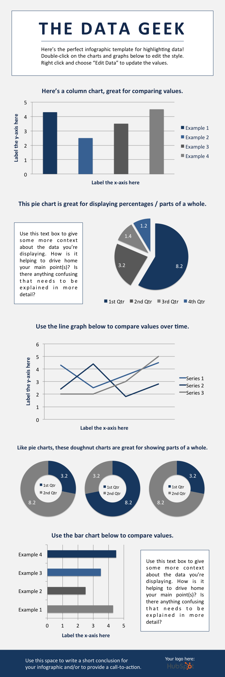
When you have new data to reveal to the world, you can use an infographic to display that data as part of a cohesive, visual narrative. And that's exactly what the Data Geek template is for.


We've loaded this template with a variety of different charts and graphs, which you can easily update with your own data. (Just right-click on a graph, choose Edit Data, and you'll be able to customize the values in an Excel spreadsheet.)
What to Add to a Data-Centric Infographic
- Column chart: Use for comparing different categories or for showing changes over time (from left to right).
- Pie chart: Use for making part-to-whole comparisons. (Note: They work best with small data sets.)
- Line graph: Use for showing data that changes continuously over time. Ideal for displaying volatility, trends, acceleration, or deceleration.
- Doughnut chart: Use a pie chart. This stylistic variation allows you to put a number, graphic, or other visual in the center of the chart.
- Bar chart: Use a column chart. (The horizontal bars make it easier to display long category names.)
2. Timeline Infographic
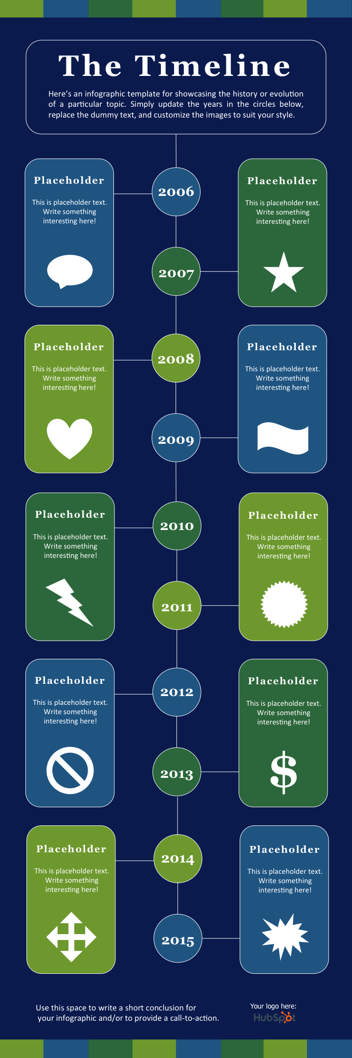
Telling the history of a particular industry, product, brand, trend, or tactic can be a great topic for an infographic. And while there are a variety of different ways that you can visualize time — including in a circle, which is what we did with our Google algorithm updates infographic — the timeline is by far the most common and easiest design method to use.


Timeline Infographic Best Practices
- Research. Research. Research. The best timeline infographics aren't just beautifully designed — they also tell a great story based on extensive research. So before you start the design phase of your infographic, put in the time to surface the best information possible.
- Narrow the scope: Timelines that cover hundreds or thousands of years can certainly be interesting, but they can also require weeks or months of research. To keep your sanity, stick with shorter time periods.
- Keep your copy concise: Infographics are supposed to be visual. If you find yourself writing 100+ words for each date on your timeline, a blog post may be the better content format.
3. Modern Design Infographic
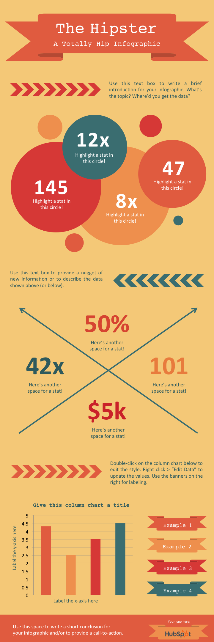
For this infographic template, we wanted to do something that reflected modern design trends, including using banners and arrows.
In terms of content, we provided plenty of space for both stats and copy. There's also a column chart at the bottom. But remember, you can always add different charts and graphs to the template wherever you see fit. Just select Insert > Chart ... and you'll have several options to choose from.


Modern Design Infographic Best Practices
- Experiment with new color palettes. There are tons of free color palettes online. Don't believe me? Do a Google image search of “Color Palette”. When you find a palette you like, drag the image directly into your PowerPoint presentation. Next, select the Color Fill bucket, choose More Colors ... and click on the eyedropper icon. With the eyedropper tool, you can select colors from your palette and use them for elements in your infographic.
4. Flowchart Infographic
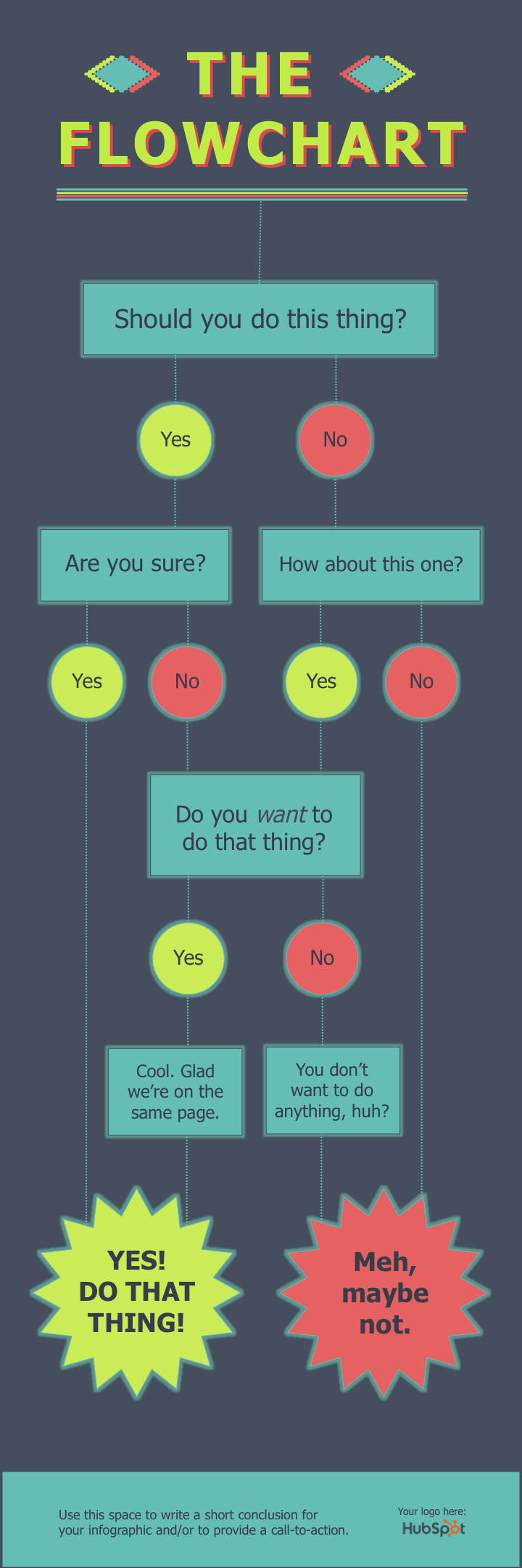
While on the surface a flowchart infographic may appear simple and fun, a lot of thought and planning needs to go into making sure the different sections logically flow into each other.
In our flowchart PowerPoint template, we created a basic flowchart structure, with positive responses guiding viewers to a conclusion at the bottom left of the infographic and negative responses guiding viewers to a separate conclusion at the bottom right of the infographic.


Flowchart Infographic Best Practices
- Draw out the branches beforehand. Before you dive into PowerPoint, get out a pen and paper and do a rough outline of your flowchart. Test for weaknesses in your logic by answering questions in every possible combination and seeing where you end up. For best results, have a friend or coworker run through the flowchart, too.
- The smaller the scope, the easier the execution. The more questions or stages you add to your flowchart, the more difficult it will be to create (and the harder it will likely be for viewers to understand). So try to narrow the focus of your flowchart.
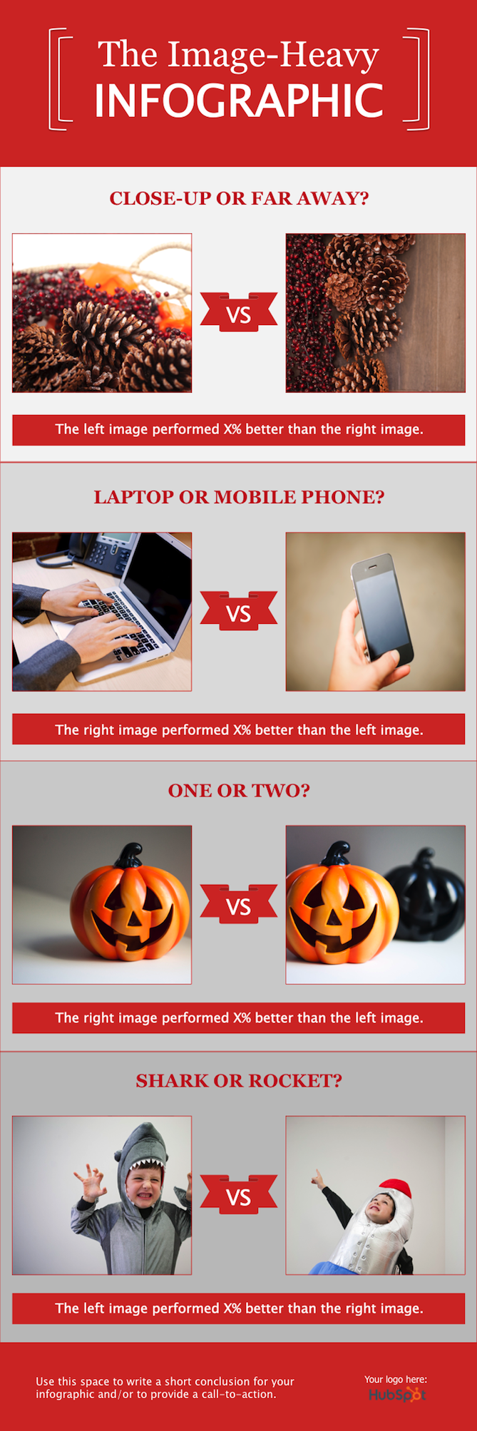
5. Image-Heavy Infographic
So far, the infographic templates we've looked at have relied primarily on illustrations that you can create within PowerPoint. But of course, there's no reason why you can't bring external photos and other images into your infographic design.
We've created this image-heavy infographic template for that exact purpose. It's great for comparing different categories, ideas, or results, and since you don't need to create or customize a lot of shapes, it's a lot less work.


Image-Heavy Infographic Best Practices
- Use high-quality images. It's better to scale down a big image (e.g. 2,000 pixels by 2,000 pixels) than to scale up a small image (e.g. 20 pixels by 20 pixels) to fit a particular space. The latter approach will result in images appearing pixelated and grainy.
- Use borders. Adding borders to your images will help make them feel like their part of a cohesive design. In PowerPoint, you can control the size, style, and color of borders under the Format Picture tab.
- Save your infographic as a PNG file. This is a best practice for all infographics but is particularly relevant when publishing an infographic that contains photographs. The PNG extension offers better quality than other options. To save your finished infographic as a PNG file, you simply need to choose File > Save As ... and select PNG from the dropdown.
Make an Eye-Catching Infographic Today
The possibilities are endless when you discover how to start creating infographics. You’ll be able to expand your skills as a marketer and create more elaborate content that your audience will be intrigued by and engage with. We hope you found this article useful and that you’ll take the initiative to build your own infographics in PowerPoint.
Editor’s note: This article was originally published in October 2020 and has been updated for comprehensiveness.


